Websites are 100% essential for even the smallest businesses, but building one is a daunting task for many owners with little experience in design. Luckily, platforms like WordPress, GoDaddy, and SquareSpace (among many others), make it easy to get your site up and running. With ready-to-go templates, personalizing your pages is quick, easy, and cheap enough for the busiest entrepreneur.
The flipside to that convenience is that it can get the creative juices flowing a little too much, encouraging users to add more features, images, colors, and pages than they really need. Your homepage is often where customers form their first impressions of your company, so it’s vital to keep things as simple and inviting as possible.

It’s also the place to begin building a strong brand. Your homepage is like your storefront, you need to draw visitors in with a unique visual appeal before bombarding them with product info, promotional offers, and testimonials.
Why is website design for small business important?
Website design is vital for small businesses as it shapes first impressions and builds credibility. A mobile-friendly, fast, and appealing site improves user experience and boosts trust. Collaborating with top UI UX design companies in the USA can help achieve these goals effectively.
Strategic design also enhances search rankings, driving organic traffic and helping small businesses compete. A well-designed site acts as a 24/7 storefront, showcasing value and engaging customers.
When doing a small business website design, keep in mind these three key components:
Aesthetic Appeal
You don’t need to be Picasso to create a beautiful page. Complementary colors, clean lines, and a clutter-free layout are easy on the eye and convey professionalism. Social media widgets, sidebars, and scrolling marquees are indeed more opportunities to add information about your business, but it’s best to break them up across your site’s pages; piling them in one place can be overwhelming to a first-time visitor… and drive them to look elsewhere. You may also use AI that creates images.
Take for example the website for Starr Restaurants. Stephen Starr runs over a dozen restaurants in Philadelphia, New York City, New Jersey, and Florida, but his homepage consists of only the company name, one large image, and a short sidebar menu, all against a simple grey background. The prominent and colorful images that flash in the center box are all that’s needed to make this simple page eye-catching.
Functionality

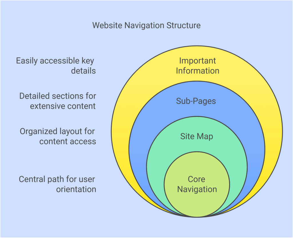
Once you’ve got browsers hooked on your good looks, hold onto them with an organized and simplistic site map. Keep pages as short as possible, creating sub-pages for content that may be necessary, but occupies a lot of space. Categories and sub-headings are easy to navigate and help users keep track of information and where to find it if they visit again. A site path that tracks visitors’ browsing also helps them stay oriented among your pages. An example: Home >> Products >> Software >> Features. Linking each of those back to their original page also helps browsers navigate your site.
Don’t forget to make important info easy to find, like contact info, business hours, and a short “About” section that clearly explains what your business does.
Consistency
To solidify your brand, your image must stay consistent. Create a logo using a logo maker, and use it to as a theme across all aspects of your website. Stick with the same colors, use the same font as your page headings. If you have a “mascot” or signature character, have him appear on multiple pages. A unified brand will stick more firmly in your web visitors’ memories, and the uniformity will give your site a cleaner and more sophisticated look as a whole.
If you choose to install additional software, like a helpdesk solution, check to make sure you can customize those windows or pages to fit your site’s overall theme.
Conclusion
A well-designed website is essential for small businesses. Prioritize simplicity, functionality, and consistency to create a professional and lasting impression.
Your site is often a customer’s first interaction with your brand, so make it count. Following best practices builds credibility and turns visitors into loyal customers.


